|
|
Working with Comparison Results |
|
|
Working with Comparison Results |
Once the Comparison Expert is launched, CATALYST compares all the resources for the selected Active Object(s). As the Expert performs the comparison, all differences are listed in the Comparison window under the respective groups: Different, Added and Removed.
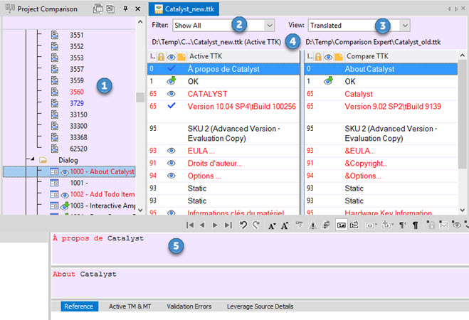
Clicking a comparison hit in this window opens the resource in Project comparison view:

Use the Project Comparison window to view and navigate the results of the comparison. This window is located on the left edge, alongside the Navigator window in the Alchemy Project Environment.
Click the  button to lock the window in place, allowing you to navigate the compared resources in the same way you do in the Navigator window. The default anchored position is between the Navigator Window and the Workspace window. Restore the default windows position in the User profile.

The Project Comparison window can be configured to show the results by resource list (default) or in Groups view. Click ![]() to toggle between the 2 views.
to toggle between the 2 views.
Showing the results by Group organizes the contents to display in collapsible headers; Additions, Deletions, Differences and Similarities, depending on your selection in the Options tab.
While working in the Project Comparison mode, the header of the workspace area is colored to match the Project Comparison window. This color is customizable in the User Profile. The default color is a light purple.

|
Bot the Project Comparison and the Project Workspace windows display the differences using colors. The colors used as Red, Green and Blue. With black representing no difference.
|
|
Red |
|
|
This colour is used to denote an object that has changed. This may include changes to co-ordinate, IDs or other programming information listed in the Properties tab. |
|
|
Green |
|
|
Denote objects that have been removed or deleted. |
|
|
Blue |
|
|
Used to denote new or added objects. |
At any point you can switch from the Project Comparison view to the standard workspace by clicking on a resource in the Navigator Window. And return to the Project Comparison by clicking on a resource in that window. Clicking a comparison hit in the Results window also sends you to the Project comparison view and opens the matching resource.
This allows to edit the Active TTK while comparing with another TTK. May be the previous TTK which contains the source file of the previous build you localized in CATALYST.
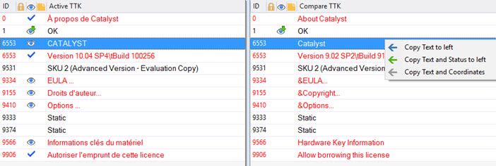
A right click context menu is available on each individual segment to copy the text, status and coordinates from the compared TTK to the Active TTK.